Pandemics sabotage even the best laid plans. In addition to more than five million deaths and counting, COVID has profoundly disrupted our economy, our institutions, and our personal lives. Whether you were planning to attend a wedding, host a conference, open an office, manage a school, govern a community, or go on well-deserved vacation, the virus got in the way. By the time you’re tracking the latest surge, it’s already too late to change anything that required advance planning, and rigorous forecasts are only reliable up to a few months into the future. But most important things take time and preparation, so how are you supposed to plan for the long-term?
The good news is that two years in, seasonal patterns are emerging in how COVID ripples across the United States, and you can leverage these patterns to plan ahead using the figure below.
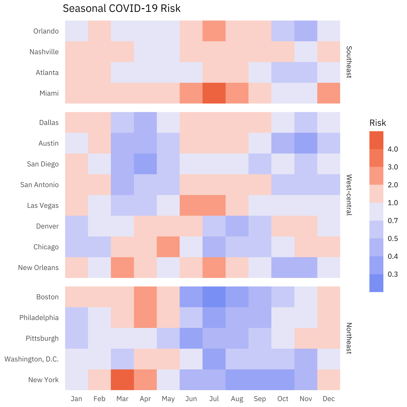
What does this mean for you? If you want to take surf lessons in San Diego, paddle out in April. If you’re convening an executive roundtable in Manhattan, September is a great time. If you want to get married in Miami, don’t book a date in July. If your company is expanding to Austin, host the launch party in November.
That’s all you need to know to use the figure, so feel free to stop reading right now and incorporate these risks into your planning. But for the curious, let’s dig into the story behind all those blue and red boxes.
Last year, researchers studying the spread of COVID across North America discovered that neighboring regions have patterns of peaks and troughs—COVID case waves—that are more similar to each other than to relatively remote regions. This effect appears to be independent of COVID intervention policies (e.g. stay home orders and mask policies), and occurs across state and national borders.
In the figure, we grouped cities into three regions that show similar seasonal COVID case wave patterns: Northeast, Southeast, and West-Central. Within each region, COVID case rates exhibit regular seasonality. The Northeast has a seasonal peak in the winter and spring, followed by a period of relatively low cases in the summer months. By contrast, the Southeast has two peaks: one in winter and another in summer. The West-Central region shows a mix of the Northeast and Southeast regions, with cities in Louisiana, Texas, Nevada, and California showing patterns similar to the Southeast, and cities in Colorado and Illinois showing a pattern more similar to the Northeast.
The reason for these seasonal patterns is still unclear. They might be driven by changes in the weather which lead to changes in daily behaviors and activities. They might also be caused by historical events that resulted in different industries and economies across the country. Regardless of the cause, the nearly two years’ of case rate data suggest these patterns are repeating annually.
To compare the risk of being infected with COVID in cities across the United States at different times of year, we defined a risk score. First, we calculated the probability of catching COVID in a particular city for each month from March 2020 to December 2021. Then we divided each result by the probability of catching COVID anywhere in the United States in the same month to create a ratio. Finally, we calculated the mean of these monthly ratios across 2020 and 2021. This provides a risk score for each combination of city and calendar month shown in the figure. A score of 1.0 indicates that the risk of catching COVID in a city during a given month is the same as the national average during the same month. A score of 2.0 indicates that the risk in the city is twice the national average, whereas a score of 0.5 indicates a risk of half the national average.
The risk score for each city and month is defined with respect to the national average for two reasons. First, doing so establishes a baseline risk for each month that every individual location can be compared against. Assuming that you will be somewhere in the United States in a given month, the risk score shows your relative risk in each included city. Second, we can account for the fact that there were more cases overall in 2020 compared to 2021 by putting the relative risk for each location in both 2020 and 2021 on the same scale. This enables us to represent seasonal risk variability in a “typical” year while incorporating all available data from both 2020 and 2021. We used case data from the COVID-19 Data Repository and population data from the 2020 U.S. Census for our calculations.
The point of all these calculations is simple: Once you identify a consistent pattern, you can play it forward to extrapolate what the future might hold. The seasonal patterns illustrated in the figure offer only a rough guide—although more precision is possible in certain situations—but you already use rough seasonal patterns to plan ahead all the time: you wouldn’t plan a ski trip to Colorado in August or expect to see spectacular foliage in New Hampshire in March. With this tool, you can ensure that your plans align with COVID seasonality to minimize the risk of the pandemic derailing your event or operations.